

In this article we will share how to make preloading with bounce animation effects.
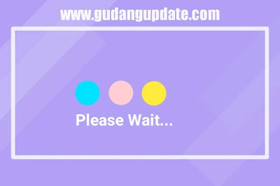 And this preloading also only uses CSS without Javascript. Now if you're curious, let's get straight to the point of making it.
For the first stage, we first create the CSS. Here is an example of CSS:
For the whole example, when combined it would be like this:
Live Demo
That's the preloading tutorial that we can share today, hopefully it's useful and can be useful for you all.
For the first stage, we first create the CSS. Here is an example of CSS:
* {
  box-sizing: border-box;
  margin: 0;
  padding: 0;
}

body {
  height: 100vh;
  width: 100vw;
  background: #7637A4;
  display: flex;
  justify-content: center;
  align-items: center;
}

.ball-container {
  width: 10rem;
  height: 10rem;
  position: absolute;
  animation: updown .55s ease-out alternate-reverse infinite;
}

.ball {
  width: 10rem;
  height: 10rem;
  position: absolute;
  border-radius: 50%;
  background: #c9f364;
  overflow: hidden;
  z-index: 1;
  box-shadow: 0 0 2px 3px #fcfcfc;
  animation: rotate 3s linear infinite;
}
.ball:before {
  content: '';
  position: absolute;
  width: 100%;
  height: 100%;
  border-radius: 50%;
  border: 5px solid #fcfcfc;
  left: -67%;
  filter: blur(0.5px);
}
.ball:after {
  content: '';
  position: absolute;
  width: 100%;
  height: 100%;
  border-radius: 100%;
  border: 5px solid #fcfcfc;
  right: -67%;
  filter: blur(0.5px);
}

.shadow {
  align-self: flex-end;
  width: 10rem;
  height: .3rem;
  border-radius: 25%;
  background: rgba(56, 56, 56, 0.75);
  margin-bottom: 1rem;
  z-index: 0;
  animation: shadow .55s ease-out alternate-reverse infinite;
}

@keyframes updown {
  from {
    transform: translateY(95%);
  }
  to {
    transform: translateY(-90%);
  }
}
@keyframes rotate {
  from {
    transform: rotate(0deg);
  }
  to {
    transform: rotate(360deg);
  }
}
@keyframes shadow {
  from {
    transform: scale3d(0.15, 1.25, 1);
  }
  to {
    transform: scale3d(1.25, 0.75, 1);
  }
}
<div class="ball-container">
  <div class="ball"></div>
</div>
<div class="shadow"></div>
For the whole example, when combined it would be like this:
<html>
<head>
<meta charset="utf-8">
<style>
* {
  box-sizing: border-box;
  margin: 0;
  padding: 0;
}

body {
  height: 100vh;
  width: 100vw;
  background: #ffffff;
  display: flex;
  justify-content: center;
  align-items: center;
}

.ball-container {
  width: 10rem;
  height: 10rem;
  position: absolute;
  animation: updown .55s ease-out alternate-reverse infinite;
}

.ball {
  width: 10rem;
  height: 10rem;
  position: absolute;
  border-radius: 50%;
  background: #FF7EAA;
  overflow: hidden;
  z-index: 1;
  box-shadow: 0 0 2px 3px #fcfcfc;
  animation: rotate 3s linear infinite;
}
.ball:before {
  content: '';
  position: absolute;
  width: 100%;
  height: 100%;
  border-radius: 50%;
  border: 5px solid #fcfcfc;
  left: -67%;
  filter: blur(0.5px);
}
.ball:after {
  content: '';
  position: absolute;
  width: 100%;
  height: 100%;
  border-radius: 100%;
  border: 5px solid #fcfcfc;
  right: -67%;
  filter: blur(0.5px);
}

.shadow {
  align-self: flex-end;
  width: 10rem;
  height: .3rem;
  border-radius: 25%;
  background: rgba(56, 56, 56, 0.75);
  margin-bottom: 1rem;
  z-index: 0;
  animation: shadow .55s ease-out alternate-reverse infinite;
}

@keyframes updown {
  from {
    transform: translateY(95%);
  }
  to {
    transform: translateY(-90%);
  }
}
@keyframes rotate {
  from {
    transform: rotate(0deg);
  }
  to {
    transform: rotate(360deg);
  }
}
@keyframes shadow {
  from {
    transform: scale3d(0.15, 1.25, 1);
  }
  to {
    transform: scale3d(1.25, 0.75, 1);
  }
}
</style>
</head>
<body>
<div class="ball-container">
  <div class="ball"></div>
</div>
<div class="shadow"></div>
</body>
</html>
Live Demo
That's the preloading tutorial that we can share today, hopefully it's useful and can be useful for you all.